
08, Interface concept
OrganisationIndependent concept
MrBet
Responsive sports discovery concept
The concept explores how a dense sports product can organise live information, editorial insight, picks and rankings across desktop and mobile without losing a clear reading order.
Interface design concept · Desktop and mobile · Figma design and prototype
Project brief
About
MrBet is presented here as an independent responsive interface concept, with desktop and mobile screens and linked Figma prototypes.
Problem
Sports discovery interfaces can place live information, categories, editorial content, picks and rankings in competition for attention.
Objective
Explore a clear hierarchy for those content types across a wide desktop canvas and a compact mobile screen.
Scope, work needed
- Desktop concept at 1440 by 768
- Mobile concept at 390 by 844
- Navigation, live ticker and sport categories
- Insight cards, picks, rankings and casino discovery artwork
- Separate desktop and mobile Figma prototype routes
Our contribution
A responsive interface exploration covering desktop and mobile compositions.
A shared hierarchy for navigation, live information, sport categories, editorial insight, picks and rankings.
Figma prototype routes for the desktop and mobile concepts.
Design narrative
01Organise a dense desktop view
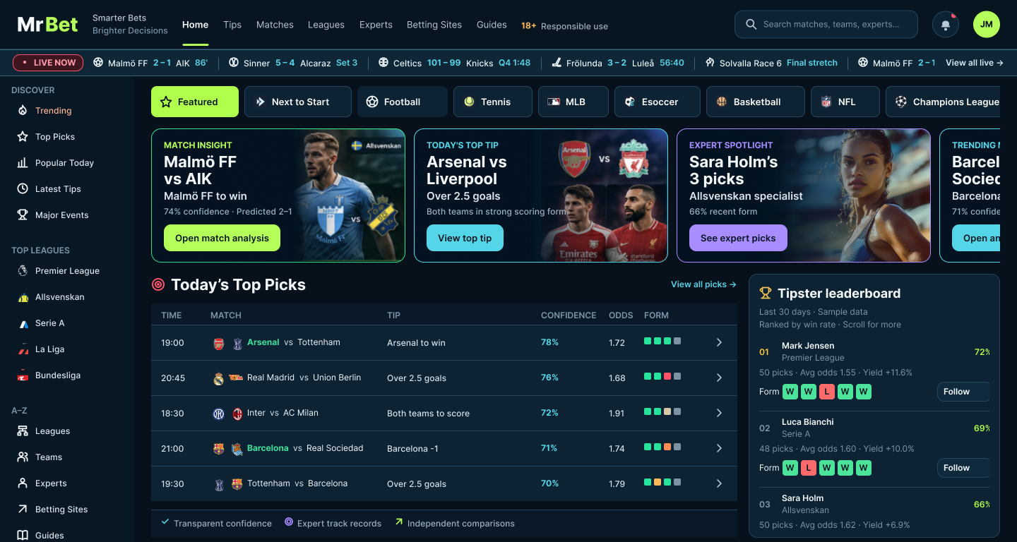
The desktop concept uses a persistent sidebar, live ticker and horizontal sport categories before moving into insight cards, picks and rankings.
Home / Desktop · 1440 × 768
Desktop interface concept
02Restack the same priorities for mobile
The mobile concept compacts the header and navigation, keeps the ticker and categories near the top, and restacks the content into a single reading path.
Home / Mobile · 390 × 844
Mobile interface concept
Systems & responsive
Design system
The two views share navigation, ticker, category, content-card, picks and ranking patterns while changing their composition for the available width.
Responsive behaviour
The mobile view uses a compact header, horizontally available categories and a single-column sequence rather than shrinking the desktop layout.
Prototype
Figma prototype
Separate prototype routes are available for desktop and mobile.
Open the separate desktop and mobile Figma prototype routes to inspect the concept at each target size.
Explore prototype routes
Gallery
2 images
1 / 2
Home / Desktop · 1440 × 768
Desktop interface concept
Project notes
The gallery contains the supplied durable Figma PNG exports, including the Featured treatment, and links to the source design file and prototype routes.
- This work is presented as an independent interface concept.
- No product outcomes or implementation claims are associated with these screens.
Takeaway & evaluation
A consistent hierarchy can retain live context and discovery choices while adapting a dense sports interface from desktop to mobile.
Outcome metrics not available.
What to measure
Proposed evaluation, not conducted research.
- Can someone distinguish live information, editorial insight, picks and rankings at a glance?
- Does the mobile sequence preserve the priorities visible in the desktop concept?